
Monday, 12 January 2015

Sunday, 11 January 2015

Saturday, 10 January 2015
Preliminary Product - Contents page drafts

Draft 2 feedback : The text needs to be raised to spread the text out to avoid negative space

Draft 1 feed back : The curve is messy so i need to make it smoother and I think the text should be curved to make the reader scan across the text as if they are looking across the room
Friday, 9 January 2015

Thursday, 8 January 2015
Preliminary Portfolio - Front cover mock ups.

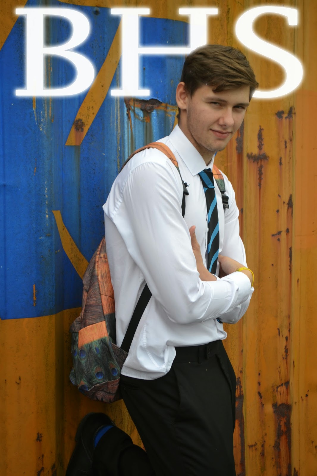
Feed back: This mast head doesn't flow with the house style i intend to create for my product to represent the school therefore i planned to use a simpler font style.

Wednesday, 7 January 2015
Preliminary Product - Semiotics - Images
Semiotics – images (preliminary product):


This is a comparison between formal and informal magazines on the left is a magazine which has an informal image due to the sporting environment around the school which would appeal to sporting families who aren't 100% focused on achieving educational success however on the right is a formal clean magazine which presents a clean strict environment which appeals to parents similar to my magazine who want educational developments and success for their child.
Tuesday, 6 January 2015
Preliminary Product - Mast head fonts
Mast Head Fonts - Preliminary Product


I sampled each font and reviewed which was best, in order to keep my product formal simple and clear I selected the bottom font which is “Copperplate Gothic Bold”. This font is clean and easy readable from a distance. If you look at many professional magazines they all have a simple mast head font so anyone can easy establish what the magazine is focused upon and what the contents is related to. Also readers can judge the formality of a magazine from its font, therefore I have chosen an official style.

I sampled each font and reviewed which was best, in order to keep my product formal simple and clear I selected the bottom font which is “Copperplate Gothic Bold”. This font is clean and easy readable from a distance. If you look at many professional magazines they all have a simple mast head font so anyone can easy establish what the magazine is focused upon and what the contents is related to. Also readers can judge the formality of a magazine from its font, therefore I have chosen an official style.
Subscribe to:
Posts (Atom)