Tuesday, 6 January 2015

Preliminary Product - Genre conventions


Genre Convention:

The school magazines I analysed followed usual conventions, they consisted of:

Ø  Sell lines – the motifs of the school are presented to give readers an impression of the schools morals and what it tries to support around school.

Ø  A clean crisp font – This in effect makes the magazine quickly identified by anyone who sees the front cover.

Ø  Simple image presenting the schools uniform and formality. Additionally if they were attractive the readers would be drawn to the magazine.

Ø  Colour schemes which mirror the colour scheme of the school. The colours usually are bright which is a common feature used by magazines to catch the reader’s attention. Furthermore this would quickly enable people to recognise which school the magazine has been produced by.

Ø  Stories which appeal to both parents and the students

Ø  The price (free).

Ø  Masthead – the convention of using a mast head is done to allow reader/ buyers to categorize the magazine and therefore identify what the magazines contents is related to.

Monday, 5 January 2015

Preliminart Product - Layout Plan


Front cover:

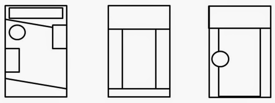
I have selected the first layout option due to it going against conventional layouts of blocked columns and minimalistic designs. Also the slanted lines make your eyes flow down the page as eyes follow lines. Furthermore the more detailed complex design represents how the school likes to keep busy and get involved in lots of things giving off a vibe of pride in what the school has achieved.
Contents page:

Contents Page:

Due to the selection of the layout for the front page I kept the slanted lines and mast head to create a flow between the first page and the contents page. However I changed the positioning to accommodate the use of a contents page.  I then curved the text to give the page depth and make the contents page more interesting compared  to the usual common layout and design.

Sunday, 4 January 2015

Preliminary Product - Image Plan


Model:
Callum P
Camera height/angle/distance:
Medium close up image, taken from shoulder height, from a reasonable distance away. This will include all of the upper body showing the uniform to readers in order to give the school a formal representation.
Location:
On the school site outside to create good lighting.
Mise-en-scene (Including props , costume) :
The costume will be the sixth form uniform and all other objects will be omitted to prevent any distractions from the subject.
Attempted Connotation:
A culture of success and formality.
Planned Denotation:
A posing student facing the camera. Looking reasonably happy. The student must be smart and formal to put across the schools primness.
Contingency (in case of model absence/weather):
Choose another suitable model and take images within the building.
Alternate angle:
Wide angle shot with the main subject surrounded by other passing pupils.
Thinking points:
If the images have to be taken in doors artificial light may be needed.

Friday, 2 January 2015

Preliminary Product - Colour Scheme


Prelim colour scheme:
Blue stands for trust, honesty and loyalty. It is sincere, reserved and quiet, and doesn't like to make a fuss or draw attention. Also it stands for reliability and responsibility. Additionally blue is the schools main colours and therefore people will recognise it as modest but the blue still impacts and catches the readers eye. This will contrast the simple colours of black and white in addition to the yellow background which pushes the image out of the page creating an effect which captures attention. The magazines I analyses however contradicted the techniques I have used. This therefore allows my magazine stand out compared to other products in the market.

Thursday, 1 January 2015

Preliminary Product - Existing products magazine analysis


Preliminary Product - Target Audience

I have chosen by analysed professional products and tried to replicate the conventions used in their products. Therefore i will target the same audience as them which would be students, parents and teachers. This links into why i have selected a formal crisp house style as it represents the school in a good light and leaves a good impression on the reader if the product created portrays outstanding features.