Front cover:
I have selected the first layout option due to it going
against conventional layouts of blocked columns and minimalistic designs. Also
the slanted lines make your eyes flow down the page as eyes follow lines.
Furthermore the more detailed complex design represents how the school likes to
keep busy and get involved in lots of things giving off a vibe of pride in what
the school has achieved.
Contents page:
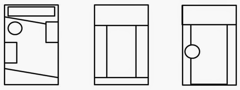
Contents Page:
Due to the
selection of the layout for the front page I kept the slanted lines and mast
head to create a flow between the first page and the contents page. However I
changed the positioning to accommodate the use of a contents page. I then curved the text to give the page depth
and make the contents page more interesting compared to the usual common layout and design.

No comments:
Post a Comment