Saturday, 10 January 2015

Preliminary Product - Contents page drafts


 Draft 2 feedback : The text needs to be raised to spread the text out to avoid negative space


Draft 1 feed back : The curve is messy so i need to make it smoother and I think the text should be curved to make the reader scan across the text as if they are looking across the room

Thursday, 8 January 2015

Preliminary Portfolio - Front cover mock ups.

Feed back: This mast head doesn't flow with the house style i intend to create for my product to represent the school therefore i planned to use a simpler font style.


Feed back: This mast head even though it is simpler isn't quite what I had pictures and doesn't have a crisp look which i feel is needed to create a professional formal vibe initially from the mast head alone.
Feed back: This mast head is the style i have chosen to use as it ticks all the boxes to create a crisp, formal and professional image which i feel are all good qualities for a school to be represented under to the target audience.

Wednesday, 7 January 2015

Preliminary Product - Semiotics - Images


Semiotics – images (preliminary product):

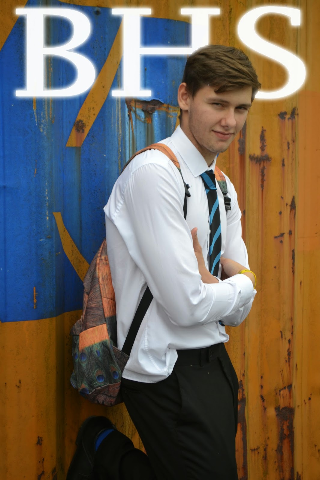
From the images I took I chose the image which represented the school how I planned it too, which is, formal, smart and filled with students with pride. This all in results achieves an image which my target audience want to see and therefore appeals to their best interests.


This is a comparison between formal and informal magazines on the left is a magazine which has an informal image due to the sporting environment around the school which would appeal to sporting families who aren't 100% focused on achieving educational success however on the right is a formal clean magazine which presents a clean strict environment which appeals to parents similar to my magazine who want educational developments and success for their child.

Tuesday, 6 January 2015

Preliminary Product - Mast head fonts

Mast Head Fonts - Preliminary Product


I sampled each font and reviewed which was best, in order to keep my product formal simple and clear I selected the bottom font which is  “Copperplate Gothic Bold”. This font is clean and easy readable from a distance. If you look at many professional magazines they all have a simple mast head font so anyone can easy establish what the magazine is focused upon and what the contents is related to. Also readers can judge the formality of a magazine from its font, therefore I have chosen an official style.

Preliminary Product - Genre conventions


Genre Convention:

The school magazines I analysed followed usual conventions, they consisted of:

Ø  Sell lines – the motifs of the school are presented to give readers an impression of the schools morals and what it tries to support around school.

Ø  A clean crisp font – This in effect makes the magazine quickly identified by anyone who sees the front cover.

Ø  Simple image presenting the schools uniform and formality. Additionally if they were attractive the readers would be drawn to the magazine.

Ø  Colour schemes which mirror the colour scheme of the school. The colours usually are bright which is a common feature used by magazines to catch the reader’s attention. Furthermore this would quickly enable people to recognise which school the magazine has been produced by.

Ø  Stories which appeal to both parents and the students

Ø  The price (free).

Ø  Masthead – the convention of using a mast head is done to allow reader/ buyers to categorize the magazine and therefore identify what the magazines contents is related to.

Monday, 5 January 2015

Preliminart Product - Layout Plan


Front cover:

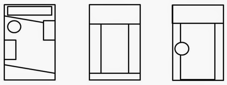
I have selected the first layout option due to it going against conventional layouts of blocked columns and minimalistic designs. Also the slanted lines make your eyes flow down the page as eyes follow lines. Furthermore the more detailed complex design represents how the school likes to keep busy and get involved in lots of things giving off a vibe of pride in what the school has achieved.
Contents page:

Contents Page:

Due to the selection of the layout for the front page I kept the slanted lines and mast head to create a flow between the first page and the contents page. However I changed the positioning to accommodate the use of a contents page.  I then curved the text to give the page depth and make the contents page more interesting compared  to the usual common layout and design.