Saturday 31 January 2015

Main Product - Colour pallete

Colour Palette:

Red

Red is the colour of fire and blood, so it is associated with energy, strength, power, determination. It is a very emotionally intense colour. It enhances human metabolism, increases respiration rate, and raises blood pressure. It has very high visibility, which is why stop signs, stoplights, and fire equipment are usually painted red. Red brings text and images to the foreground. Use it as an accent colour to stimulate people to make quick decisions; it is a perfect colour for 'Buy Now' or 'Click Here' buttons on Internet banners and websites.

White

White is associated with light and goodness. It is considered to be the colour of perfection. It means safety, purity, and cleanliness. As opposed to black, white usually has a positive connotation. White can represents success.

Black

black is associated with power, elegance, formality and mystery such as EDM is a mystery to what will come next .It represents strength and authority; it is considered to be a very formal, elegant, and prestigious colour. Black contrasts well with bright colours. Combined with red or orange – other very powerful colours – black gives a very aggressive colour scheme.

Friday 30 January 2015

Main Product - Register Of Language


Register of Language:

The magazines I analysed used technical language which readers with an interest in the genre would understand such as the music styles under the head genre of EDM such as; future house, deep house, progressive house, trance etc. However abbreviations such as “ADE” are used on the front covers to speed up how fast people can scan the page. I plan to use formal language in my product and use technical terms.

Thursday 29 January 2015

Main Product - Layout Plan


Layout


The front cover layout is a column format with an image separating the columns; this is a conventional layout for a front cover of a magazine. The image will take up a majority of the page therefore making readers feel as if there isn’t much to read and it is quickly processed when they scan the page. This is due to eyes following lines made by the blocks of text in columns.

The contents page layout goes against conventional newspaper style columns and I decided to use horizontal columns as I believe this would make the information easier to read. This is due to the fact that people read from left to right. I tried to break up the page using images in the top right and bottom left corners. I thought this would make the page less overwhelming.


The double page spread layout is very minimal which is intended as I didn’t want readers to focus on anything else but the DJ which is intended to be the main focus of this issue. Therefore I took up a large majority of the two pages with an image of the subject and then places to small text boxes in opposite corners to draw the eyes in a diagonal style across and down the page.

Wednesday 28 January 2015

Main Product - Representations


Representation:


My magazine represents the age bracket I have tried to target; I have constructed this representation by:


Young image subject – This gives readers someone to relate to such as Martin Garrix who also started at a young age and as a result of this he has a huge fan base. Younger stars also cause interest by older DJ’s and people are interested in where they are from and how they have achieved their dream. Therefore by doing this more people will want to buy the magazine which will help my magazine be a successful product. The models hair cut


The sound wave outline makes it look slightly informal due to the rough divide it creates between blocks of text; this however still looks professional due to the genre the magazine is focused upon and EDM is all about new styles and being different so I have therefore tried to go again the convention of looking clean and professional.


Props – The use headphones


Costume – The fact that the model is wearing a clean white, casual t shirt follows conventions of having quite bland plain clothing. Additionally DJ’s usually select clothing dependent upon their music style. Therefore the clothing suggests the DJ plays and produces tracks with a common clean style however the t shirt is creased showing how the DJ has a rough side to his music tracks. The branding of the t-shirt is Hollister which people associate with an American lifestyle. It is owned by Abercrombie & Fitch Co. The brands designs were intended to attract consumers aged 14–18, at a lower price point than the parent brand. It was ranked as the second most preferred clothing brand of US teens with proves it can be noticed and identified by young readers therefore creating a link between the DJ and readers of a younger audience.


The positioning of the subject looking away from the camera represents the thought process and goals which all DJ’s have which isn’t to focus upon becoming famous but to follow their passion for music; this allows the readers to relate to the star. His expression looks slightly sad and moody which is a convention used by all EDM.

Monday 26 January 2015

Main Product - Mast Head Fonts Selection


Font Selection


The reason I chose the third font is due to target market research that I completed which showed me that it appealed to a younger audience and had a stronger futuristic, modern appeal. I aimed to create something that was up to date and presented the futuristic scene which is used at EDM festivals and gigs across the globe by giving a certain number of free magazines to distribute at festivals.


Friday 23 January 2015

Main Product - Name Selection


Magazine Names:


1.EDMagazine


2. TranceTimes


3. Bassline Magazine


The reason I chose to select the name “EDMagazine” was due to it instantly allowing buyers to identify what genre of music it is about. Commonly only people who have a strong interest in EDM understand what it means and what it stands for. This allows me to ensure only my target audience purchase it.

Thursday 22 January 2015

Main Product - Target Audience


Target Audience Research:
The majority of people that were willing to purchase my magazine were males who were in the age range of 16-20, as they are the common subscribers to magazines. Men were also willing to pay more than women due to them having a stronger interest in EDM (electronic dance music).
Due to them being willing to pay more and having a stronger interest in the genre I plan to target my magazine at young men in order to ensure I have a successful product.


Contents Research:

From my contents research survey I established that readers would be interested in the majority of topics which have the minimum amount of texts. Therefore I will try to keep the pages quite simple where possible in order to maintain the reads focus. The readers would be interested in all the topics I suggested and therefore I will include as many as possible to please the buyers. 

Sunday 18 January 2015

Main Product - Genre Selection


Genre choice:
I have chosen the music genre of EDM which stands for electronic dance music. EDM is an overview of a variety of minor genres such as deep house, big room, techno, and trance. I have done this as EDM is slowly becoming a hit. Statistics of tomorrow land (the biggest EDM festival in the world).
·         Tomorrowland 2009 took place on July 25 and 26 and attracted 90,000 people.
·         Tomorrowland 2011 was completely sold out and had over 180,000 visitors.
This rise of 90,000 visitor in just 2 years shows how quickly its becoming popular and in result means my magazine will be one of the few magazine available meanings I would have less competitors against an ever growing crowd.

This is shown here in an image comparing 2005 Tomorrowland with 2013 Tomrrowland

Saturday 10 January 2015

Preliminary Product - Contents page drafts


 Draft 2 feedback : The text needs to be raised to spread the text out to avoid negative space


Draft 1 feed back : The curve is messy so i need to make it smoother and I think the text should be curved to make the reader scan across the text as if they are looking across the room

Thursday 8 January 2015

Preliminary Portfolio - Front cover mock ups.

Feed back: This mast head doesn't flow with the house style i intend to create for my product to represent the school therefore i planned to use a simpler font style.


Feed back: This mast head even though it is simpler isn't quite what I had pictures and doesn't have a crisp look which i feel is needed to create a professional formal vibe initially from the mast head alone.
Feed back: This mast head is the style i have chosen to use as it ticks all the boxes to create a crisp, formal and professional image which i feel are all good qualities for a school to be represented under to the target audience.

Wednesday 7 January 2015

Preliminary Product - Semiotics - Images


Semiotics – images (preliminary product):

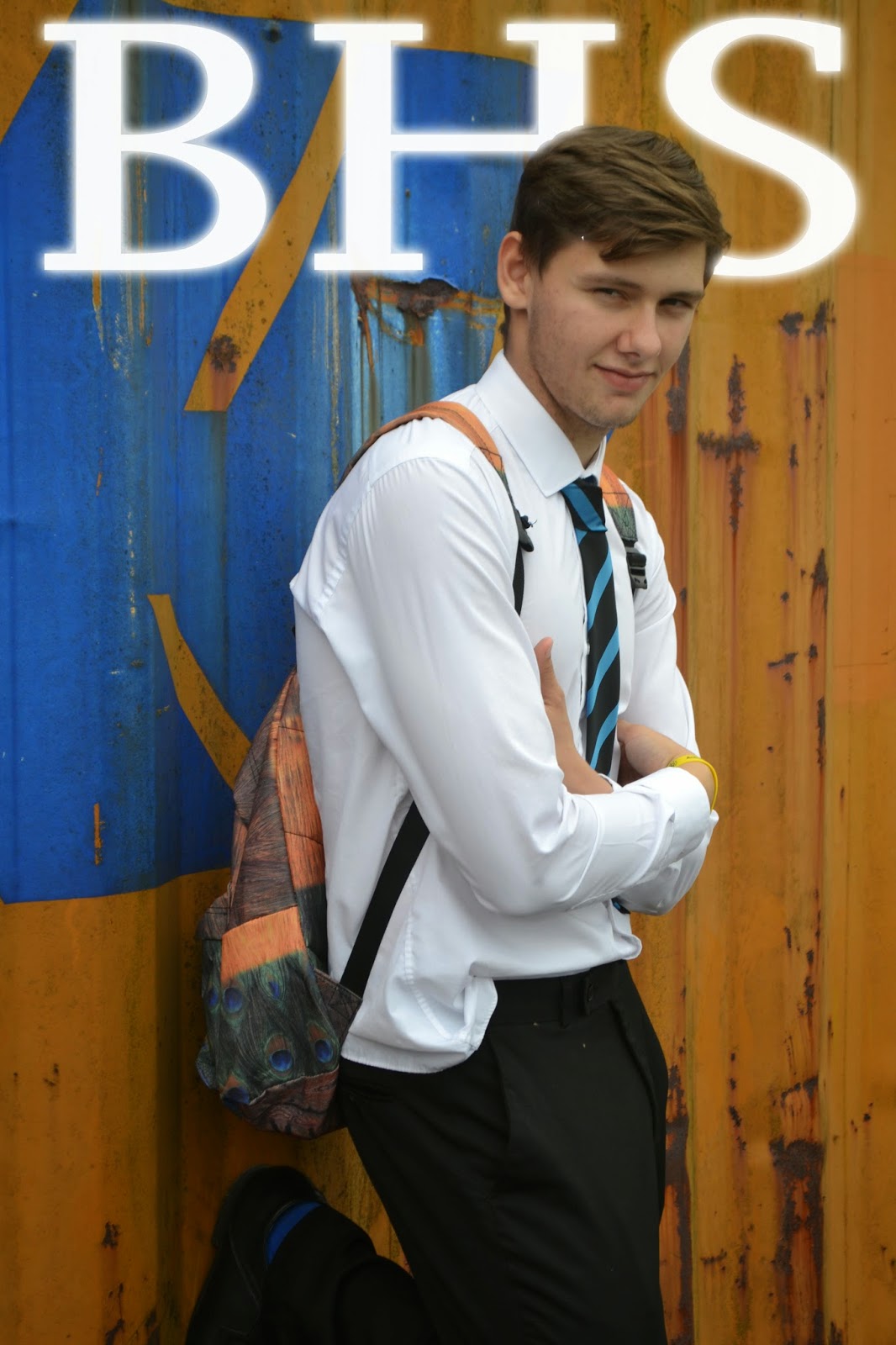
From the images I took I chose the image which represented the school how I planned it too, which is, formal, smart and filled with students with pride. This all in results achieves an image which my target audience want to see and therefore appeals to their best interests.


This is a comparison between formal and informal magazines on the left is a magazine which has an informal image due to the sporting environment around the school which would appeal to sporting families who aren't 100% focused on achieving educational success however on the right is a formal clean magazine which presents a clean strict environment which appeals to parents similar to my magazine who want educational developments and success for their child.

Tuesday 6 January 2015

Preliminary Product - Mast head fonts

Mast Head Fonts - Preliminary Product


I sampled each font and reviewed which was best, in order to keep my product formal simple and clear I selected the bottom font which is  “Copperplate Gothic Bold”. This font is clean and easy readable from a distance. If you look at many professional magazines they all have a simple mast head font so anyone can easy establish what the magazine is focused upon and what the contents is related to. Also readers can judge the formality of a magazine from its font, therefore I have chosen an official style.

Preliminary Product - Genre conventions


Genre Convention:

The school magazines I analysed followed usual conventions, they consisted of:

Ø  Sell lines – the motifs of the school are presented to give readers an impression of the schools morals and what it tries to support around school.

Ø  A clean crisp font – This in effect makes the magazine quickly identified by anyone who sees the front cover.

Ø  Simple image presenting the schools uniform and formality. Additionally if they were attractive the readers would be drawn to the magazine.

Ø  Colour schemes which mirror the colour scheme of the school. The colours usually are bright which is a common feature used by magazines to catch the reader’s attention. Furthermore this would quickly enable people to recognise which school the magazine has been produced by.

Ø  Stories which appeal to both parents and the students

Ø  The price (free).

Ø  Masthead – the convention of using a mast head is done to allow reader/ buyers to categorize the magazine and therefore identify what the magazines contents is related to.

Monday 5 January 2015

Preliminart Product - Layout Plan


Front cover:

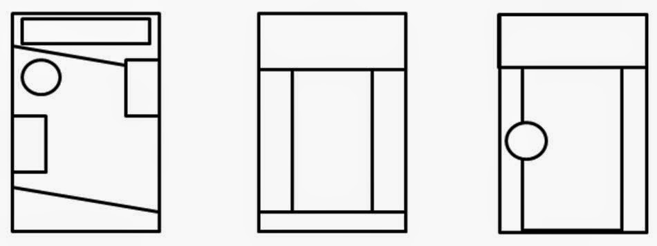
I have selected the first layout option due to it going against conventional layouts of blocked columns and minimalistic designs. Also the slanted lines make your eyes flow down the page as eyes follow lines. Furthermore the more detailed complex design represents how the school likes to keep busy and get involved in lots of things giving off a vibe of pride in what the school has achieved.
Contents page:

Contents Page:

Due to the selection of the layout for the front page I kept the slanted lines and mast head to create a flow between the first page and the contents page. However I changed the positioning to accommodate the use of a contents page.  I then curved the text to give the page depth and make the contents page more interesting compared  to the usual common layout and design.